Rysk Map
 The Rysk Map is designed to provide an enterprise view of the risk.
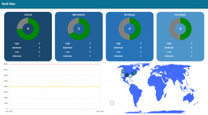
Each square tile represents a market, or region, of the enterprise. The tiles will indicate the Rysk severity levels of the program offices. Consistent with the rest of the application, red (high), yellow (moderate), and green (low) are displayed. The gray color indicates that there is not enough data to make a Rysk severity determination. Each slice of the pie chart can be clicked on and will drill down. For example, clicking on a slice will provide the Program Office, then subsequent clicking will drill down into the System, then the Assets. Note: Each drill down will only show the same severity items (ie, high, mod, or low)
In this picture, there are four markets, but some organizations may only have one and others may have more. Each tile includes the Program Offices that have been associated to that market. (The association is set by when creating or editing program offices).
The timeline displays the Rysk score for the last 90 days for each market. This provides a short history and fluctuations. The world map plots each of the markets in their proper region and will identify the severity level. (Map positions are also set when creating or editing program offices).
Clicking on the title of the tile or the plot on the map will direct the user to a more detailed breakdown of the Market. It will display all the Program Offices, Systems, and Assets in three different pie charts. This will highlight any major discrepencies such as high Rysk assets that reside on a low Rysk system.
Here, you can also drill down on a slice of the pie chart in order to get as granular as possible into the Asset.
The Rysk Map is viewable to all users of Ryskview. However, when drilling down into each market or program office, the application will enforce user permissions and restrict some information or content.